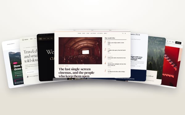
Ghost is a good home for photographers who also write: a photo essay, a travel journal, a series with its story. But most themes are designed around text, with a small image on top. Here is what to look for when photos are the point.
Full-bleed where it counts
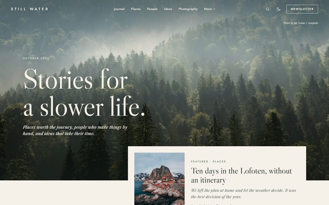
The opening image should be allowed to fill the screen. On posts, Ghost’s editor already offers wide and full-width images; check that the theme styles both, and galleries too.
Cropping you can predict
Card grids crop photos to a fixed shape. A good theme uses a few consistent ratios, so you know how a portrait or a panorama will look before you publish.
Speed with large images
Ghost resizes your uploads automatically, but only if the theme asks for the right sizes. A photo theme should serve small images on phones and large ones on big screens (responsive images), and load the rest as the reader scrolls.
Credits and captions
Captions are where the place, the light and the camera go. Make sure they are visible and readable, not hidden on hover.
Two themes built for photographs
- Evergreen opens on a full-bleed photograph and tells your journal along a timeline whose composition changes at every entry, with a dedicated photography page. Live demo.
- Kontur sets your latest posts as a wall of posters — large photo, tall photo, a story in your accent colour — or as a sideways pan. Live demo.