A magazine sells its stories; a personal blog sells a voice. The theme should make readers understand, in a few seconds, who is writing and why they would want to come back. Here is what to look for.
An opening that introduces you
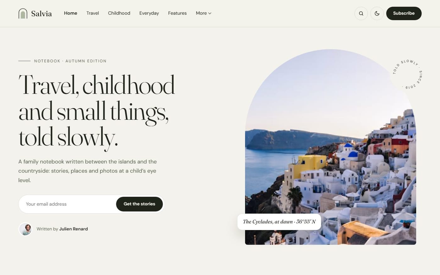
The first screen should say who you are and what you write about, with your portrait or a photo that sets the tone. Your site title and description, set in Ghost’s General settings, should appear there — not only in the browser tab.
A way to follow you, right away
Your best readers want to know when you publish. A sign-up form in the opening and at the end of each post turns a visit into a subscriber. Ghost handles the list and the emails; the theme only has to place the form well.
Posts that show their photos
Personal blogs live on images: travel, family, food, places. Prefer a layout where the picture is large and the title readable on top, rather than a thumbnail beside a paragraph.
Calm reading
Comfortable line length, a clear title, a table of contents for long stories and a reading progress bar. Nothing should pull the reader away from the text.
Light enough to set up alone
You will not hire a developer for a blog. Every section should be switchable in Design & branding, with the demo content to start from and documentation in plain words.
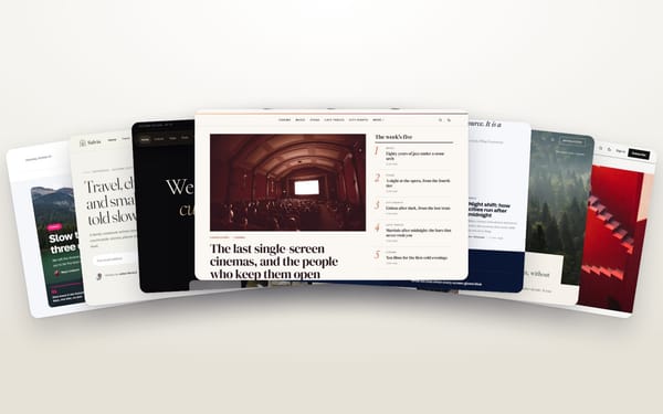
Three themes, three voices
- Salvia: warm and hand-made, an opening that introduces you with a sign-up form, stories in an edge-to-edge mosaic. Live demo.
- Gazette: colourful and lively, a slider of your best stories and a sidebar that presents you. Live demo.
- Kontur: strict and graphic, big type and one accent colour, for blogs with a strong visual identity. Live demo.